
Content design is ****answering a user need in the best way for the user to consume it. Content Design London describe it as “a way of thinking. It’s about using data and evidence to give the audience what they need, at the time they need it and in a way they expect.” Content comes in many forms such as text, image, video and data and is the most efficient when it is displayed in a way that is easy to comprehend and understand.
Content especially words is an essential part of the design process as words when written well can become the design especially when we use the perfect typography to shape those words. An example we found of this as a class is how different countries government websites display the minimum wage.
We discovered that GOV.UK where one of the best due to it clearly outlining each age groups pay while other governments such as my.gov.au made it a lot harder to locate the information as it was hidden within a paragraph of text.
<aside> 💭 This task really highlighted how the user experience can be impacted through the use of unclear and poorly displaced content rather than using clear and concise content and displaying it in a way which is intuitive and easy to locate important and useful information. This is something that needs to be taken into consideration when we design especially for our current project as it works closely with healthcare and allowing patients and professionals to access information fast and efficiently.
</aside>
A big part in why the UK government is so efficient and effective from a UX perspective is down to its strong use of the design principles created by the Government Digital Services. It consists of 10 design principles:
Start with needs
Do less
Design with data
Do the hard work to make it simple
Iterate then iterate again
Build for inclusion
Understand context
Build digital services, not websites
Be consistent, not uniform
Make things open: it makes things better
We also looked at the different styles used within the design system including typography/type scale, headings, paragraphs, links, colour, images, layout and spacing. By using this design system style, it keeps the whole government website content consistently styled and easy to understand.

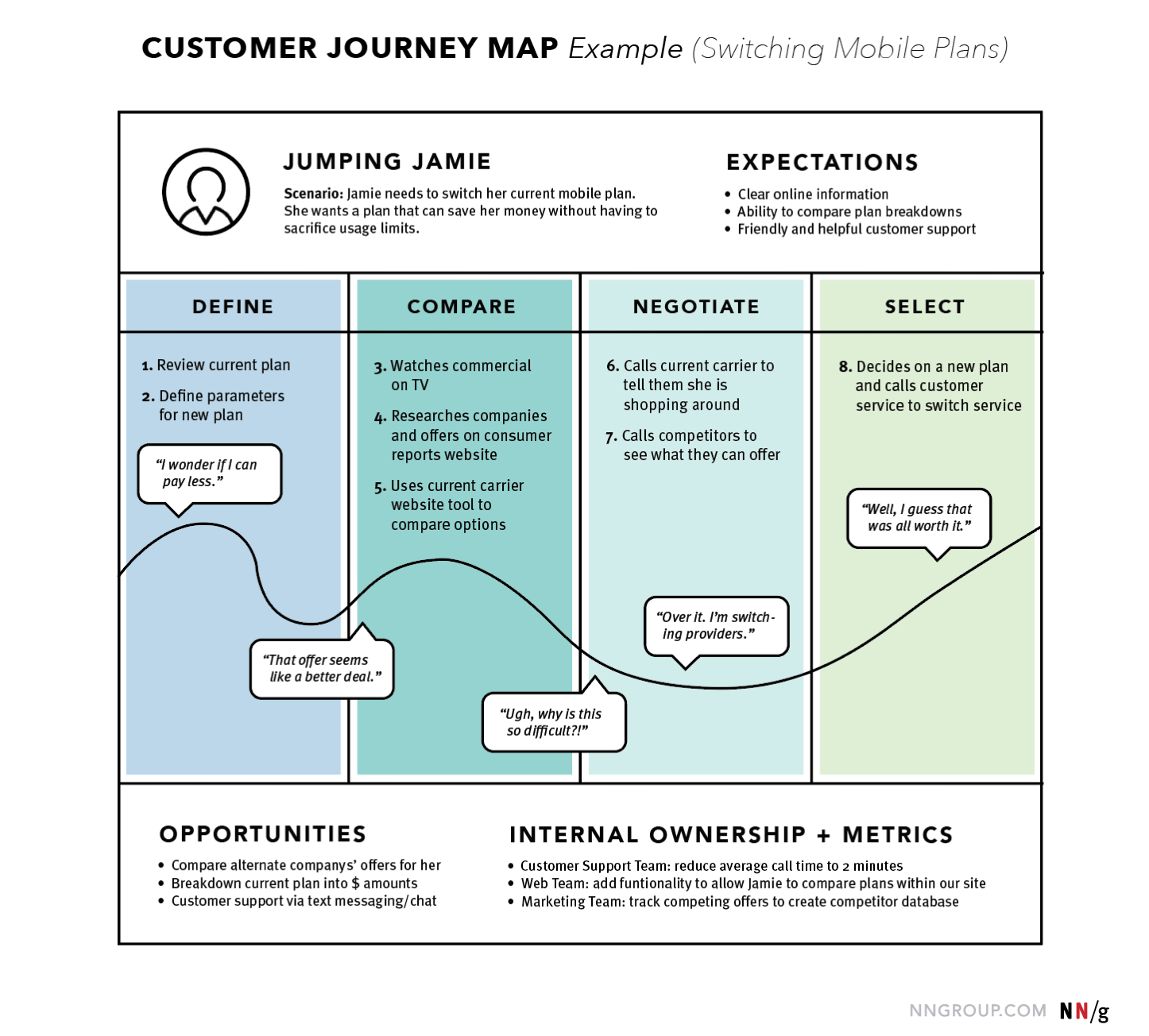
Everything we do is a journey so as UX designers we can use a journey map to visual the process that a person goes through in order to accomplish a goal. We use a journey map for customers as a way to design a story to provide insights into the customer’s journey such as their frustrations and delight throughout their interactions however it is not designed to represent a completely real experience.
Nielsen Norman describe a journey map to come in a shapes and sizes but all contain the following elements:
An Actor
A persona who experiences the journey and the map is about. Actors usually align with personas and their actions in the map are rooted in data.
Scenario + Expectations
The scenario describes the situation that the journey map addresses and is associated with an actor’s goal or need and specific expectations. The best journey maps involve scenarios which involve a sequence of events such as taking a trip.
Journey Phases
Journey phases are the different high-level stages in the journey, providing organisation for the rest of the information in the journey map. They vary from scenario to scenario however each organisation will usually have data to help it determine what these phases are for a given scenario. An example of this could be for luxurious purchases such as buying a car, the stages can be engagement, education, research, evaluation, justification.
Actions, Mindsets and Emotions
These are behaviours, thoughts, and feelings the actor has throughout the journey and that are mapped within each of the journey phases. Actions are the actual behaviours and steps taken by users, mindsets correspond to users’ thoughts, questions, motivations and information needs at different stages in the journey and emotions are plotted as single line across the journey phases, showing the emotional “ups” and “downs” of the experience.
Opportunities
Opportunities are insights gained from mapping, showing how the user experience can be optimised as well as gaining insights such as: